
Textile Museum of Canada
(Nov - Dec 2023)
Information Architecture (Lead)
Content Audit
Tree Testing
Card Sorting
Navigation Design
Treejack
Dynomapper
Adobe Photoshop
Miro
Meera Lafir
Nadia Smith
& Myself
How might we streamline the Textile Museum of Canada's website to better serve its growing, diverse audience?
- The Textile Museum of Canada is the the only museum in Canada delivering exhibitions dedicated solely to the textile arts; they aim to "inspire understanding of the human experience through textiles".
- The Museum rebranded in 2020 to better adapt to its broadening audiences during the pandemic, now diversifying to include museum visitors, artists, and community members of all backgrounds.
- Despite the rebrand however, the Museum's website remains confusing to navigate, is filled with outdated content, and does not align with its current strategic priorities.
To improve navigation, actionability, and scalability of the Museum's web and mobile sites. What do these entail?
.png)
Redesigned and responsive web and mobile sites that allow for the Museum's site visitors to quickly purchase tickets, discover the latest exhibitions and programs, and otherwise find content quickly and easily on the site.
Produced a full written report on the information architecture and navigation design findings, made recommendations, and presented the redesign to Textile Museum of Canada's stakeholders, including the Museum's CEO.


.png)

.png)
I started off by identifying the key user groups and their goals for using the Museum's website.
The primary audience for the Museum's website are museum visitors, and the site is primarily designed to cater to their needs. However, the Museum serves a diverse range of users, each with distinct needs/goals.
.png)
What pages currently exist on the Museum's current site?
To gather the content for Textile Museum Canada's websites:
- I used Dynomapper, crawling all domains (including the main site, Shop, Collections, and Blog)
- From the crawl results, I removed redundant, outdated, or stale pages using Google Sheets.
Based on the existing content inventory, I found that it did not meet the needs as well as it could have for some user groups. Below is a summary of these findings and recommendations.
.png)
I conducted two, 20-minute open card sorts with participants to inform the website's main headings.
As a group, we conducted eight card sorts in total. From the content inventory list, a list of 48 cards was created for the card sorting activity to represent unique content. Open-sort card sorting sessions were conducted virtually on Zoom with participants unfamiliar with the Textile Museum Canada's website, using Miro for categorization.
Facilitators asked probing questions, documented participants' processes, and collaboratively analyzed session notes to inform the information architecture and navigation design.

After the card sorts, clear groupings emerged, but there were also challenges encountered by participants for other areas. These challenge areas pointed us to some problem areas for the website structure.
.png)
Based on the results from the card sorts, I created an initial draft of the information architecture (IA).
Main headings at level 1 reflect labeled groups identified by participants during card sorting. Subsequent levels were organized by placing content according to its frequency under groups, prioritizing the label that participants most commonly associated with the content.
The group then got together to discuss the initial draft, and minor changes were made. This resulted in a group-reviewed version of the IA diagram, which was used for tree testing.

We asked 33 participants to test out this information architecture.
I set up a tree test using Treejack by Optimal Workshop. Our goal for the tree test to evaluate user navigation and task completion, shedding light on both successful paths and areas for potential improvement within the information architecture. The insights from the tree testing results influenced our design decisions, prompting adjustments to enhance the information architecture and navigation design.

The tree test results showed us which tasks were easy, and which ones were difficult.
I created six tasks, which represented the typical tasks of each user group. Using Treejack, my team member Nadia analyzed the results.
I compiled the findings and summarized them below in the form of correct destination (meaning the participant correctly identified the page they were supposed to visit to accomplish the task), and incorrect destination (meaning they failed to choose the correct page).
.png)
We tweaked the IA diagram once more before finalizing the website's proposed structure.
I created a finalized information architecture diagram to represent the website structure of the pages that would appear on the redesigned Textile Museum website after the card sort and tree test activities.
As a result of the findings from those tests, the team decided to make the following changes to the information architecture before moving onto the final navigation design.
.png)
With the tree test results and the subsequent changes made, our group was more confident that the key tasks performed by the target users would be more discoverable.
These changes to the IA diagram also further informed our navigation design. Below is the third and final iteration of our IA diagram.
.png)
The content is reorganized; but what features can people use on this newly designed site?
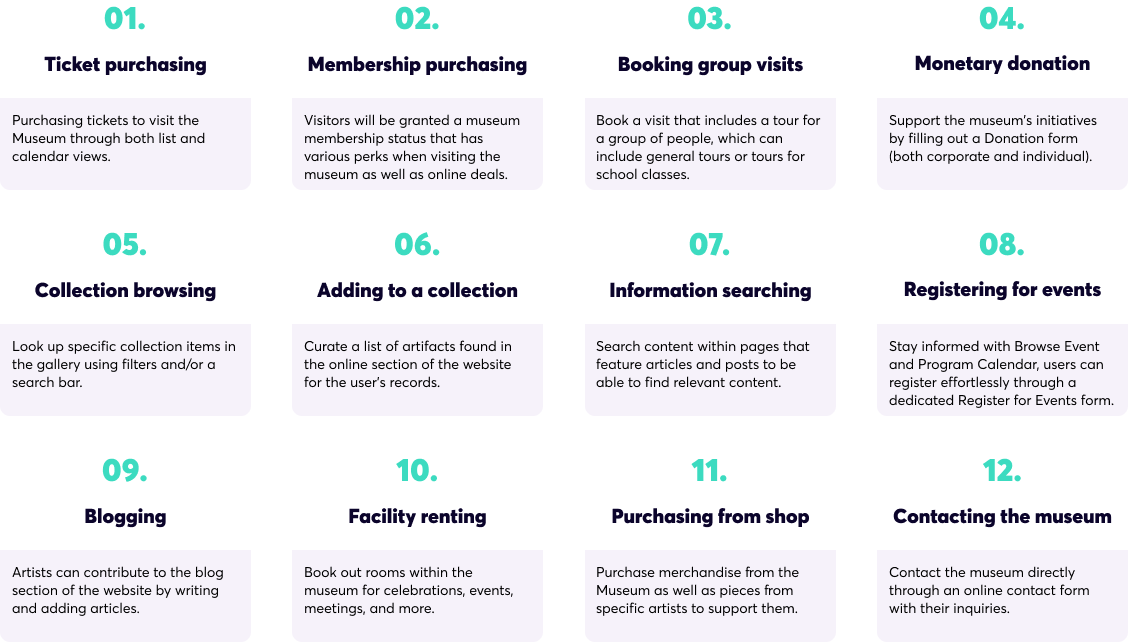
Alongside the IA diagram, we conceptualized features as team, aligning with business and user priorities that would enhance the Textile Museum's visitor experience. Our team evaluated existing features, identifying key elements crucial for the target users within the redesign context. Our prioritized features are below.
To demonstrate some key features, we created task flows showing what users would click.
Out of the features above, my team member Justin created four task flows to outline how a user would navigate through the website to use some key features.
The first two are of high priority to the Museum, as they have direct monetary implications. The third and fourth tasks are two identified areas of improvement based on existing website flows.
.png)
Low-fidelity
What will the new structure and navigation look like?
Our team collaborated together to create some low-fidelity navigation designs for both desktop and mobile, which incorporated findings from our content analysis, card sorting, tree testing, and information architecture revamp. We presented our design process to CEO and employees at the Textile Museum, where we received positive feedback about improvements to the information architecture and navigation of their websites.
The low-fi designs are annotated, and can be viewed bigger by clicking this button.

Final Iteration
I prototyped the high-fidelity version of the navigation designs to bring them to life.
The high-fidelity prototype below was created individually, iterating from the group-created low-fi version. The branding guidelines, including the colour and typography, were provided by the Textile Museum.
Prototype the rest of the task flows.
While we did design one flow, we will need to revisit the low-fidelity version to design the low-to-high-fidelity versions of all of the other task flows.
Work with Textile Museum's engineering team to implement designs.
Although this was for an industry partner and the Museum's CEO watched our final presentations for the project, the final recommendations were never actually implemented by the team at the Museum. An avenue I could pursue is to ask for more detailed feedback from the Museum's stakeholders, test with real users, and work directly with their team to make any changes as well as implement it to the live site.
Keeping an organization's strategic goals top of mind throughout the design process.
As this was the first time I designed for a real organization with a company mission, vision, values, strategies, and goals, I ensured that every design decision was not only validated by research, but also vetted against the client's strategy so that they remain realistic and impactful for the client.
Tree testing as a way to validate a website's information architecture.
I learned a new testing method called tree testing and was able to practice it for this project. In the future, I would like to inject this method at different points in the project, as it helps validate decisions both for redesigns as well as new concepts.
Just because something looks good doesn't mean it's useful.
I saw first-hand how a rebranding did not improve the usability of the Textile Museum's website. Users often have a bias for beauty. I was able to train my eye for seeking out usability patterns that needed improvement on the Museum's site despite the eye-catching graphics.
That concludes this case study. Thank you for reading!